Advanced map making tricks for R (projections, choropleths and showing specific regions)
Posted on May 18, 2022

In this example we will:
- Look at
rnaturalearth - Make a choropleth
- Play with projections a bit more.
Requirements:
Rggplot2sfrnaturalearthggrepeldplyrggsflabelrnaturalearthhiresrnaturalearthdata
If you have difficulties installing rnaturalearth and sf natively on your system,
I have found it possible by installing R and the packages in a conda environment.
I explain how to do this, here.
This post is part of a series about making maps in R:
Pulling out a specific country/region with rnaturalearth
library("rnaturalearth")
# You also need to install rnaturalearthhires for this to work.
# devtools::install_github("ropensci/rnaturalearthhires")
# devtools::install_github("ropensci/rnaturalearthdata")
au_sf <- ne_states(geounit = "australia",
                   returnclass = "sf")
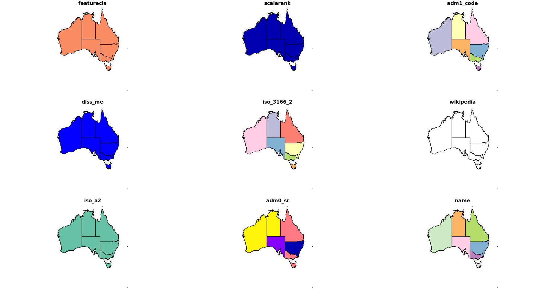
plot(au_sf)
Some example data to show on our map
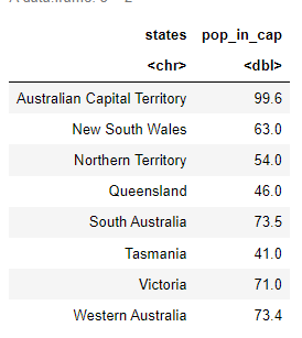
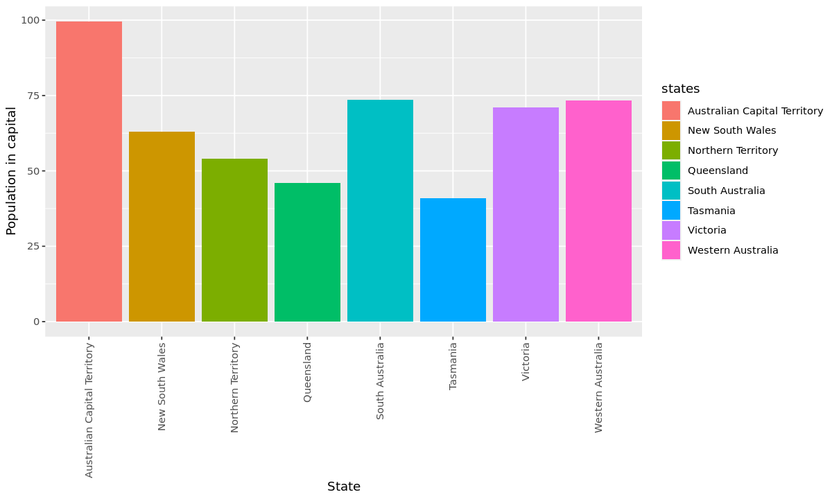
I found some numbers for the percentage of people in Australia who live in the capital for each state. If you didn't know, despite Australia being so big, most people live in one of the state capitals.
options(repr.plot.width=10, repr.plot.height=6)
states <- c("Australian Capital Territory" ,"New South Wales",
            "Northern Territory", "Queensland", "South Australia", "Tasmania",
            "Victoria", "Western Australia")

pop_in_cap <- c(99.6, 63.0, 54.0, 46.0, 73.5, 41.0, 71.0, 73.4)
df <- data.frame(states, pop_in_cap)
df
# Let's plot it just to see what we are working with.
ggplot(data=df, aes(x=states, y=pop_in_cap, fill=states)) +
    geom_bar(stat="identity") +
    ylab("Population in capital") +
    xlab("State") +
    theme(axis.text.x = element_text(angle = 90, vjust = 0.5, hjust=1))
Chrolopeth map
From Wiki:
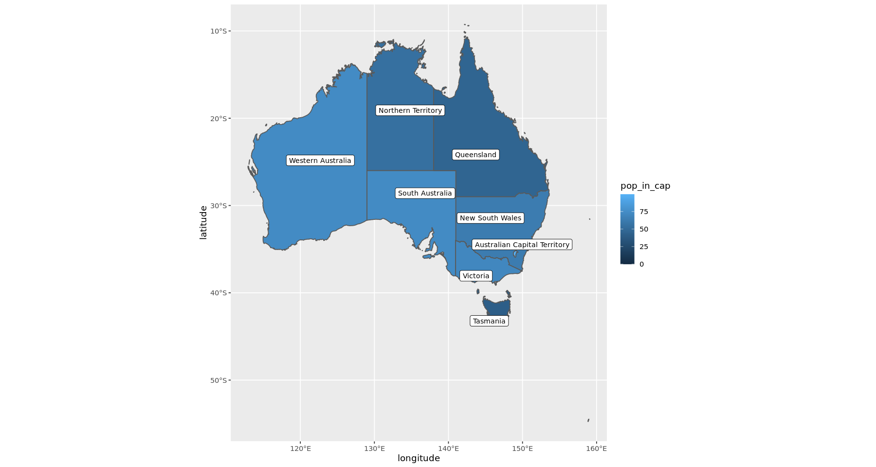
A choropleth map is a type of statistical thematic map that uses intensity of color to correspond with an aggregate summary of a geographic characteristic within spatial enumeration units, such as population density or per-capita income.
So this is basically, a map with a heatmap. You would have seen these before. One of the ones I've been looking at a lot (because of Covid19) is the lineage map from Sanger
Let's try to make one with our sample data.
library("ggplot2")
library("rnaturalearth")
library("dplyr")
library(ggrepel)
library(sf)
options(repr.plot.width=15, repr.plot.height=8)
in_sf <- ne_states(geounit = "australia",
                   returnclass = "sf")

in_sf_label <- in_sf  %>% filter(name != "Lord Howe Island", name != "Macquarie Island", name != "Jervis Bay Territory")
# Let's ignore some small regions

in_sf <- in_sf %>% select(name) %>%
  left_join(. , df, by=c("name"="states"))

in_sf$pop_in_cap[ is.na(in_sf$pop_in_cap)] = 0

australia <- ggplot() +
    geom_sf(data = in_sf, aes(fill = pop_in_cap))  +
  geom_label_repel(data = in_sf_label,
                   aes(x=longitude,y = latitude, label = name),
                   size = 3, force = 5, force_pull = 5)
australia
Map projections in R
Previously we used the baked in map projections from ggplot using coord_map(). Now I will try to customise it as we like.
Map projections are intensely complicated, and I frankly have no idea what I am doing.
The trick here is that internally everything we are looking at is just a vector graphic and to add in something like a map projection we need to transform the shapes to fit that projection. In the next few examples I will use coord_sf() to take our ggplots and transform them to show a projected map.
Standardised projections with EPSG
Rather than having to figure out all the settings yourself, people have created templates you can use. These have been picked to be the best compromise between showing something sensible while being true to the proportions of the different land masses. It is quite difficult to show something that is round - like the Earth - on a flat plane.
The one I found to be useful is the EPSG:
The EPSG is a structured dataset of CRS and Coordinate Transformations. It was originally compiled by the, now defunct, European Petroleum Survey Group. Here are some websites: https://epsg.io/ > http://spatialreference.org/
There are different projections for different regions all over the world. There are many options depending on which region you want to show, and the type of projection you would like to use.
For Australia, for instance, I found these to be common:
- EPSG "WGS 84 (ensemble) / Pseudo-Mercator (Web Mercator)" https://epsg.io/3857 - Most common!
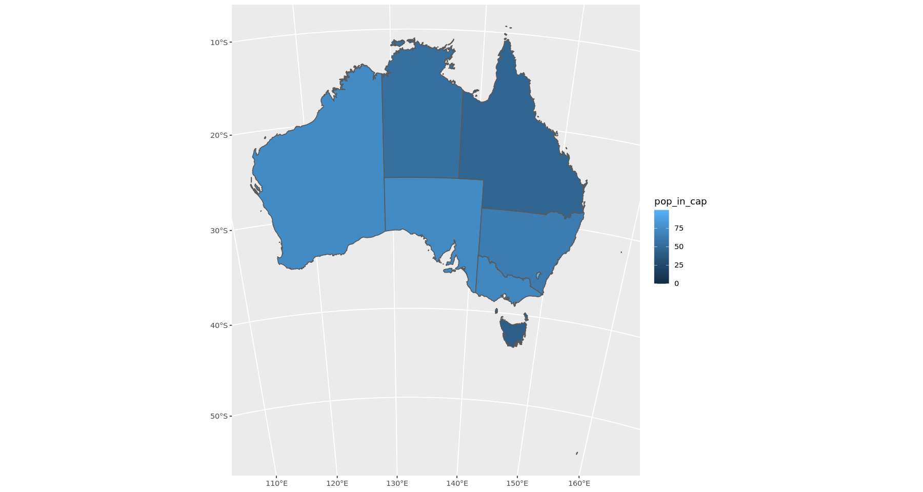
- EPSG "GDA94 / Australian Albers" (My favourite) https://epsg.io/3577
- EPSG "AGD84" https://epsg.io/4203-1236
Let's see what the difference would be. This is your standard Mercator (should look like google maps)
australia <-  ggplot() +
    geom_sf(data = in_sf, aes(fill = pop_in_cap)) +
    coord_sf(crs= 3857)
australia
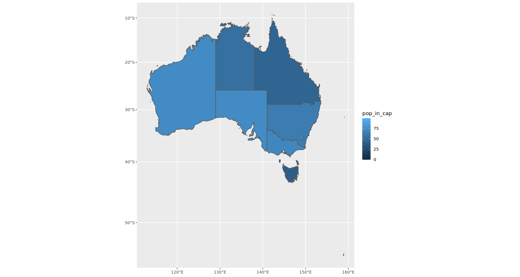
This next one is with a bit curvature, but you can still recognize all the states. I like it. Can you see the difference to the one above?
australia <-  ggplot() +
    geom_sf(data = in_sf, aes(fill = pop_in_cap)) +
    coord_sf(crs= 3577)
australia
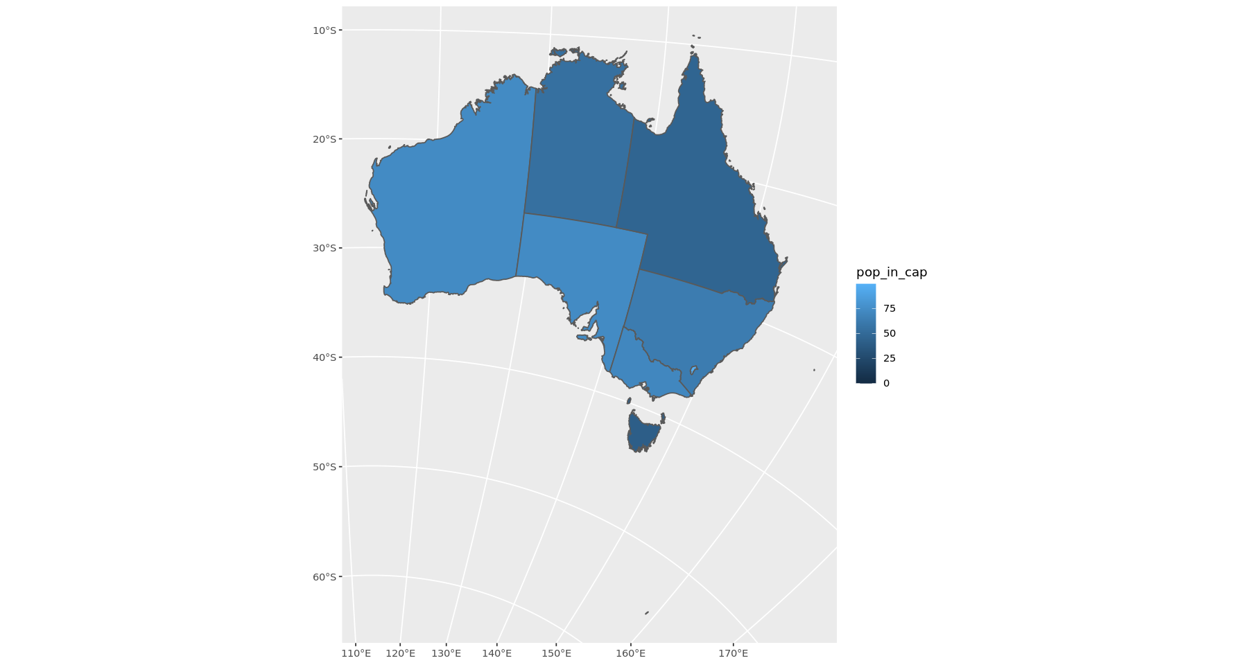
This last one is supposed to be a "Geocentric translations (geog2D domain)" centering on Western Australia (right).
australia <-  ggplot() +
    geom_sf(data = in_sf, aes(fill = pop_in_cap)) +
    coord_sf(crs= 8017)
australia
Custom settings and PROJ
You can fully customise the map and the projection using the "PROJ" strings. https://proj.org/index.html
This is a deep rabbit hole though, and it can get weird. So I would recommend sticking to the standards above. Let's look at a few custom projections.
australia <-  ggplot() +
    geom_sf(data = in_sf, aes(fill = pop_in_cap)) +
  geom_label_repel(data = in_sf_label,
                   aes(x=longitude,y = latitude, label = name),
                   size = 3, force = 5, force_pull = 5) +
  coord_sf( crs= "+proj=ortho  +lat_0=-30 +lon_0=133")
australia
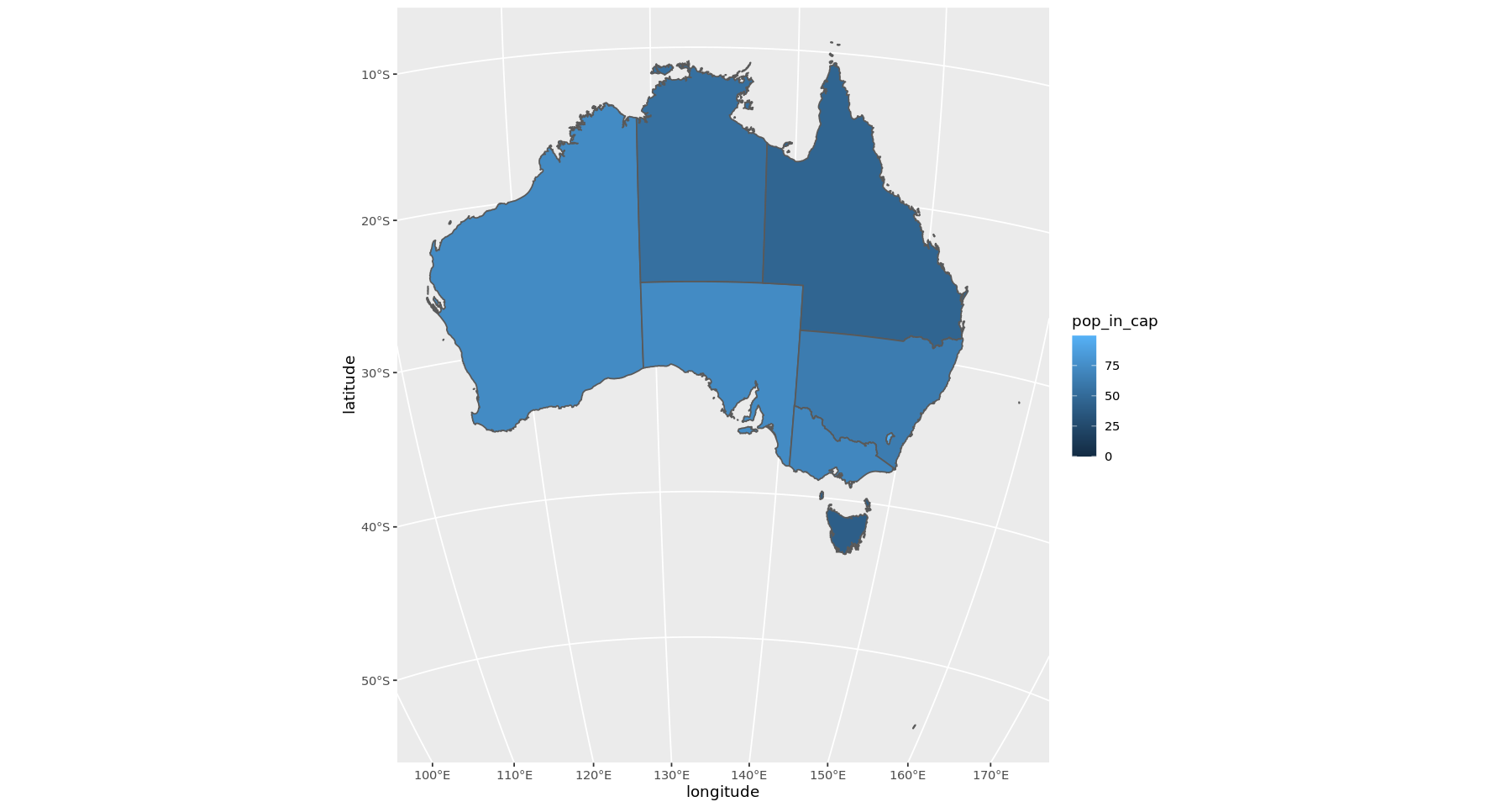
Nothing too special here, orthographic like above and The lat long settings are basically centring on the middle of the nation Let's look at a another one.
australia <-  ggplot() +
    geom_sf(data = in_sf, aes(fill = pop_in_cap)) +
  coord_sf( crs= "+proj=latlong  +lat_0=-30 +lon_0=133")
australia
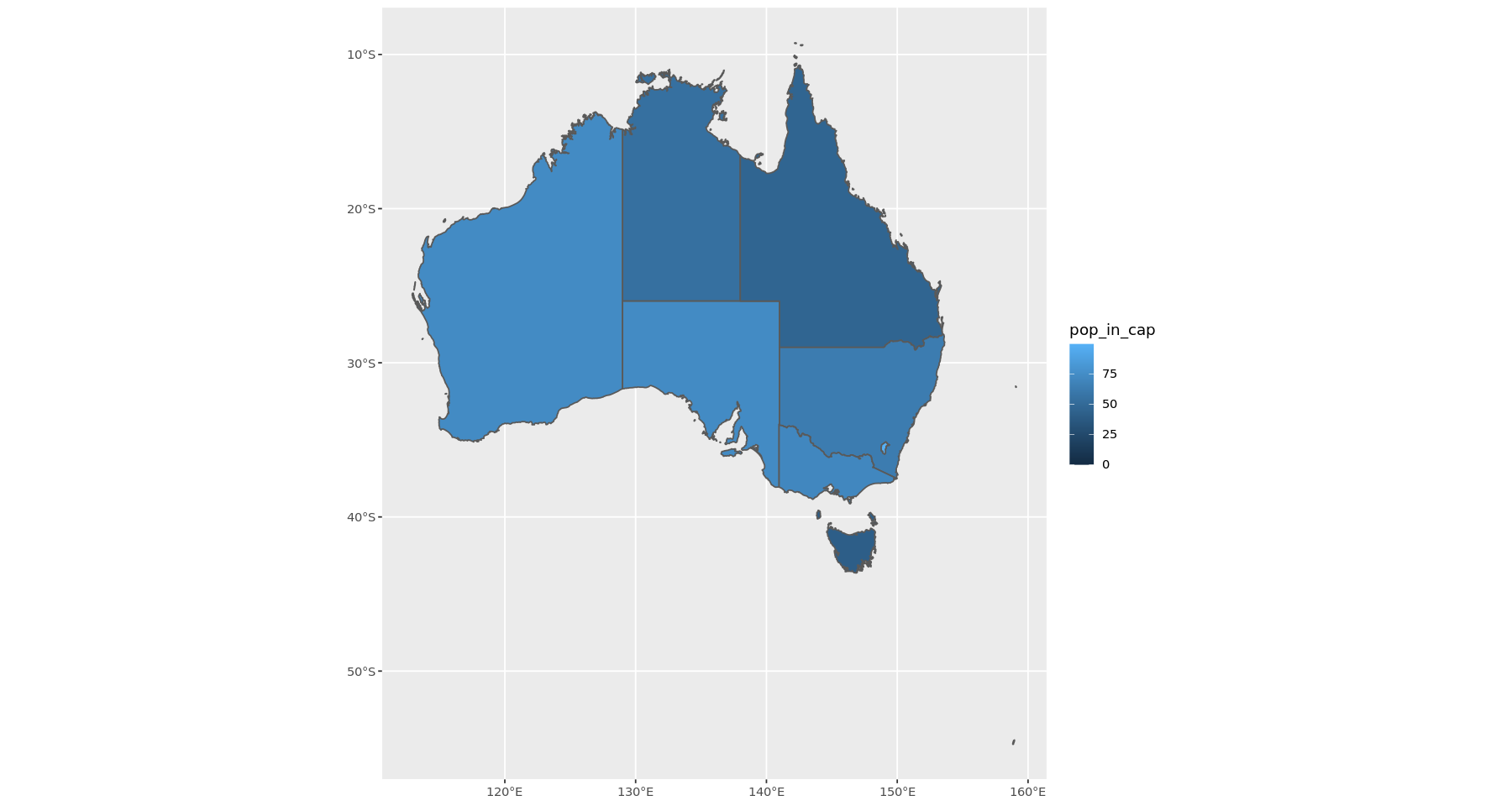
This is the same map like before but it has a normal (flat) conversion of lat and long. Let's try a strange one.
australia <-  ggplot() +
    geom_sf(data = in_sf, aes(fill = pop_in_cap)) +
  coord_sf( crs= "+init=epsg:3577 +proj=ortho +ellps=GRS80
+datum=GGRS87")
australia
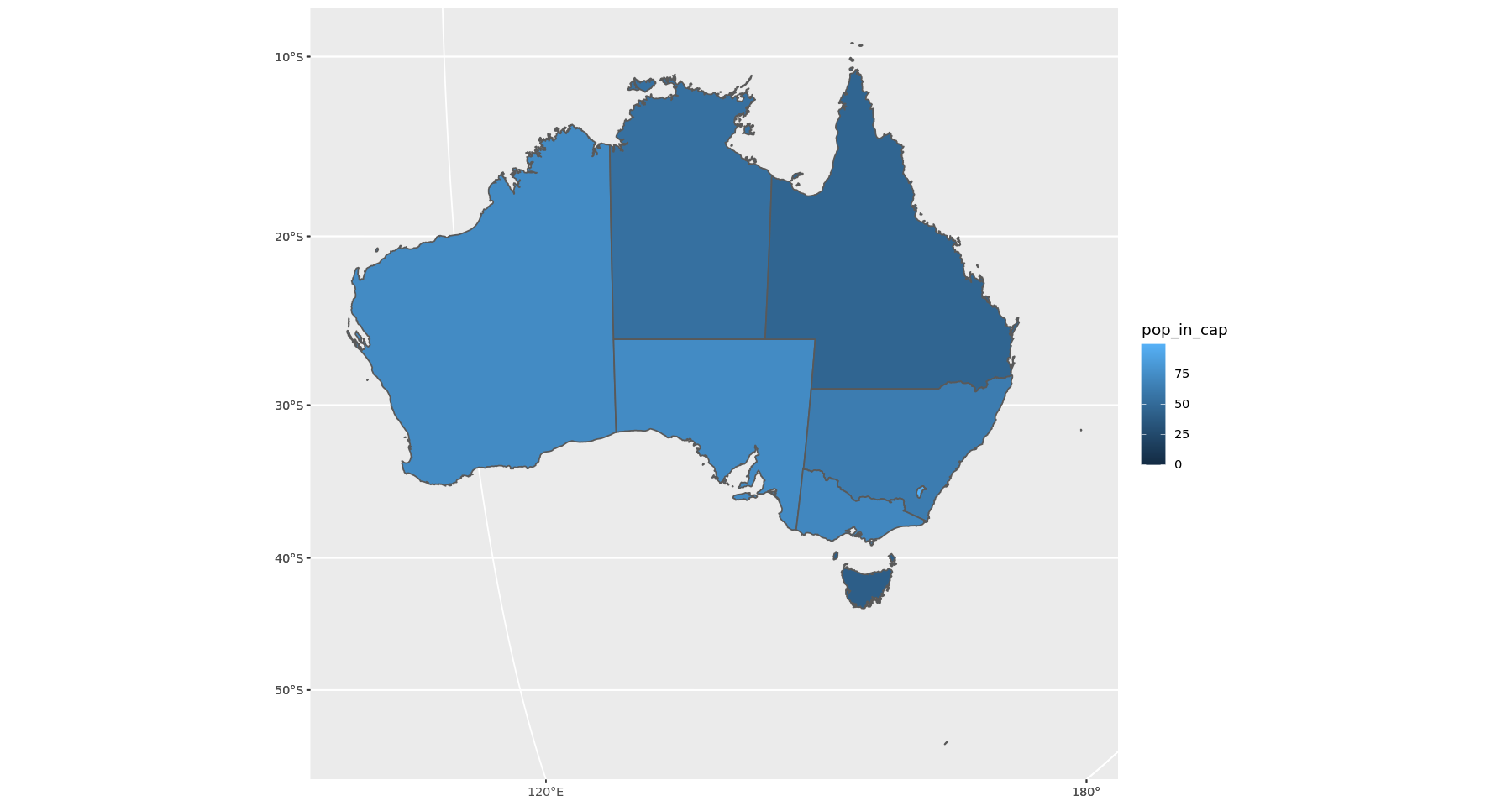
This is EPSG, orthographic projection and an Ellipsoid specified
Here are all the parameters you can feed through the proj string
| Param | Description |
|---|---|
| +a | Semimajor radius of the ellipsoid axis |
| +b | Semiminor radius of the ellipsoid axis |
| +datum | Datum name |
| +ellps | Ellipsoid name |
| +lat_0 | Latitude of origin |
| +lat_1 | Latitude of first standard parallel |
| +lat_2 | Latitude of second standard parallel |
| +lat_ts | Latitude of true scale |
| +lon_0 | Central meridian |
| +over | Allow longitude output outside -180 to 180 range |
| +proj | Projection name |
| +south | Denotes southern hemisphere UTM zone |
| +units | meters |
| +x_0 | False easting |
| +y_0 | False northing |
| +zone | UTM zone |
See https://proj.org/index.html for details
Adding labels and annotations
Let's use the weird map projection from before and try to pin some cities on the map.
It's not clearly explained in a lot of tutorials how to do this. Usually they do not apply any projection - the map is a flat mercator map - and if that is the case you can just feed in the lat/lon as X, Y co-ords and everything works out (like the first map I made).
When we do work with projections, things change. When we specify a set of co-ordinates we also need to specify what projection those co-ordinates are based on. After playing around with it for a while, it seems that is it best to ALWAYS be explicit about the projection settings, which means that when you import or create any set of co-ordinates to put on a map you should also specify the crs.
I have rationalised it as such; If I tell you that Brisbane's longitude is 153.0260, what is that in reference to? For instance, where is 0* in this case? We usually mean Grenwich is 0 but that is not always the case, and when ever we use projections in R all those assumptions are thrown out the window. I will try to illustrate that below:
label_frame <- data.frame("Label" = c("Brisbane", "Perth"), "Lat" = c(-27.4705, -31.9523), "Lon" = c(153.0260, 115.8613))

label_frame <- st_as_sf(x=label_frame, coords = c("Lon", "Lat"), crs = "EPSG:4326")
st_is_longlat(label_frame)

label_frame$geometry

# This is our weird projection from above.
this_crs = "+init=epsg:3577 +proj=ortho +ellps=GRS80
+datum=GGRS87"

st_transform(label_frame, this_crs)
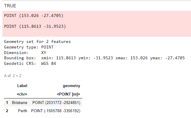
Let us step through it. First, I have created a crude dataframe of two city locations.
The st_as_sf takes our raw co-ord numbers and converts it into a geometry point.
This not only has our lat / long info, but also the projection infomation (crs).
Because these are normal lat/longs I have used a standard EPSG specification
which is "EPSG, WGS 84 -- WGS84 - World Geodetic System 1984, used in GPS".
A normal map; Grenwich is 0 etc. etc.
To check everything is ok, we can use st_is_longlat to check if it is the correct format.
Sometimes if the crs is invalid, it will silently fail and keep lon/lat the same,
you then run into problems when you try to plot the values.
If we see what this looks like before we transform, the geometry information is still recognisable as a normal lat/long.
We then use st_transform to convert the co-ordinates into our weird projection.
When we look at the new co-ords, the x, y coords are now totally different, e.g. Brisbane's co-ords
go from POINT (153.026 -27.4705) to POINT (2031772 -2924851).
In practice we don't need to do the st_transform ourselves when we are plotting.
coord_sf will apply the transformations to every layer in the ggplot. We just need to be careful about
making sure that the data points we give are in the correct format, and have a projection specified. See the example below.
this_crs = "+init=epsg:3577 +proj=ortho +ellps=GRS80+datum=GGRS87"

label_frame <- data.frame(
    "Label" = c("Brisbane", "Perth"),
    "Lat" = c(-27.4705, -31.9523),
    "Lon" = c(153.0260, 115.8613))

label_frame <- st_as_sf(x=label_frame, coords = c("Lon", "Lat"), crs = "EPSG:4326")

australia <-  ggplot(data = in_sf) +
   geom_sf(aes(fill = pop_in_cap)) +
   geom_sf(data = label_frame, size = 6, shape = 23, fill = "darkred") +
   coord_sf(crs=this_crs)
australia

Again we create the dataframe and convert it to the correct geometry object - as above.
Then we plot. I am using city co-ords to make red diamonds on the map.
We can pass it through like normal, no need to transform explicitly. coord_sf applies to the whole figure.
So what happens if we do it wrong?
crs is required for st_as_sf, it will not work otherwise but let's say we give the correct lat long but give a weird crs.
this_crs = "+init=epsg:3577 +proj=ortho +ellps=GRS80
+datum=GGRS87"

label_frame <- data.frame("Label" = c("Brisbane", "Perth"), "Lat" = c(-27.4705, -31.9523), "Lon" = c(153.0260, 115.8613))

label_frame <- st_as_sf(x=label_frame, coords = c("Lon", "Lat"), crs = this_crs)

australia <-  ggplot(data = in_sf) +
    geom_sf(aes(fill = pop_in_cap)) +
    geom_sf(data = label_frame, size = 6, shape = 23, fill = "darkred") +
    coord_sf(crs=this_crs)
australia
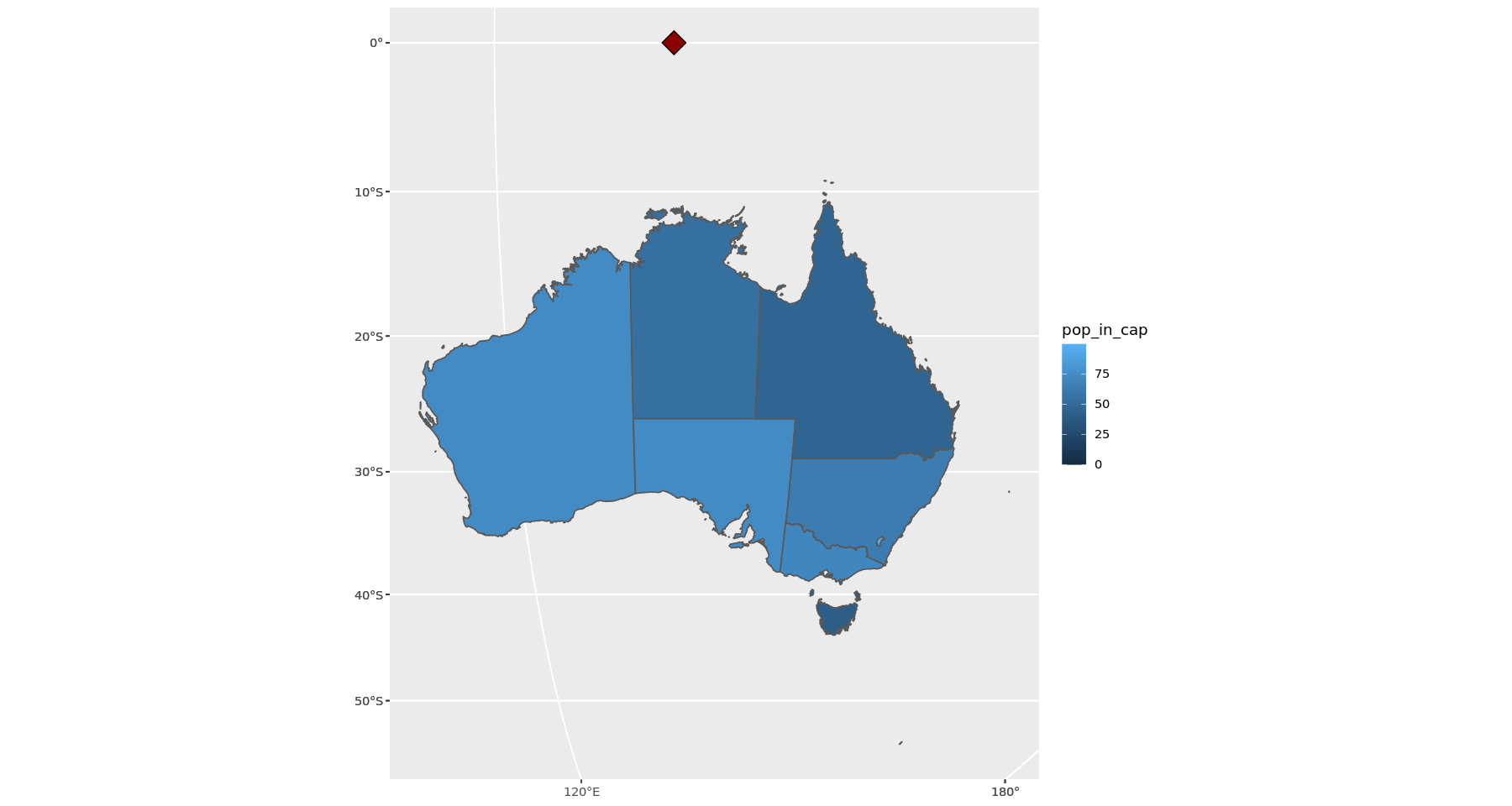
Oops. Let's try this again, without the tranformation step and feeding it to geom_label_repel (exactly like we did in the map at the start).
this_crs = "+init=epsg:3577 +proj=ortho +ellps=GRS80
+datum=GGRS87"

label_frame <- data.frame("Label" = c("Brisbane", "Perth"), "Lat" = c(-27.4705, -31.9523), "Lon" = c(153.0260, 115.8613))

australia <-  ggplot(data = in_sf) +
    geom_sf(aes(fill = pop_in_cap)) +
      geom_label_repel(data = label_frame,
                   aes(x=Lon,y = Lat, label = Label),
                   size = 3, force = 5, force_pull = 5) +
    coord_sf(crs=this_crs)
australia

# The labels repel, but the placement is broken.
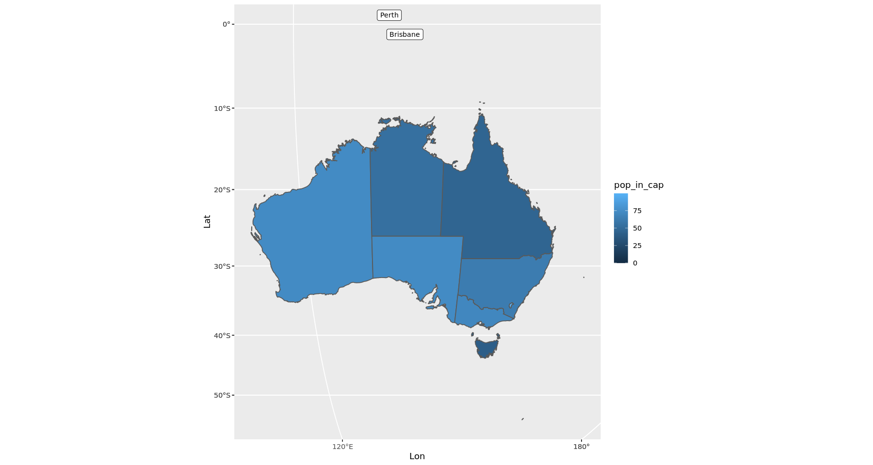
A lot tutorials do not explain the transformation properly. They usually create their data from some other library or resource that has all the correct information baked in, so they often import the map, the data, make the plot and then apply the projection transform to the plot i.e. with coord_sf and everything works fine.
Let's do one example where the labels are correct.
this_crs = "+init=epsg:3577 +proj=ortho +ellps=GRS80
+datum=GGRS87"

label_frame <- data.frame("Label" = c("Brisbane", "Perth"), "Lat" = c(-27.4705, -31.9523), "Lon" = c(153.0260, 115.8613))
label_frame <- st_as_sf(x=label_frame, coords = c("Lon", "Lat"), crs = "EPSG:4326")


australia <-  ggplot(data = in_sf) +
    geom_sf(aes(fill = pop_in_cap)) +
    geom_sf_label(data = label_frame, aes(label = Label)) +
    coord_sf(crs=this_crs)
australia

Adding repl labels
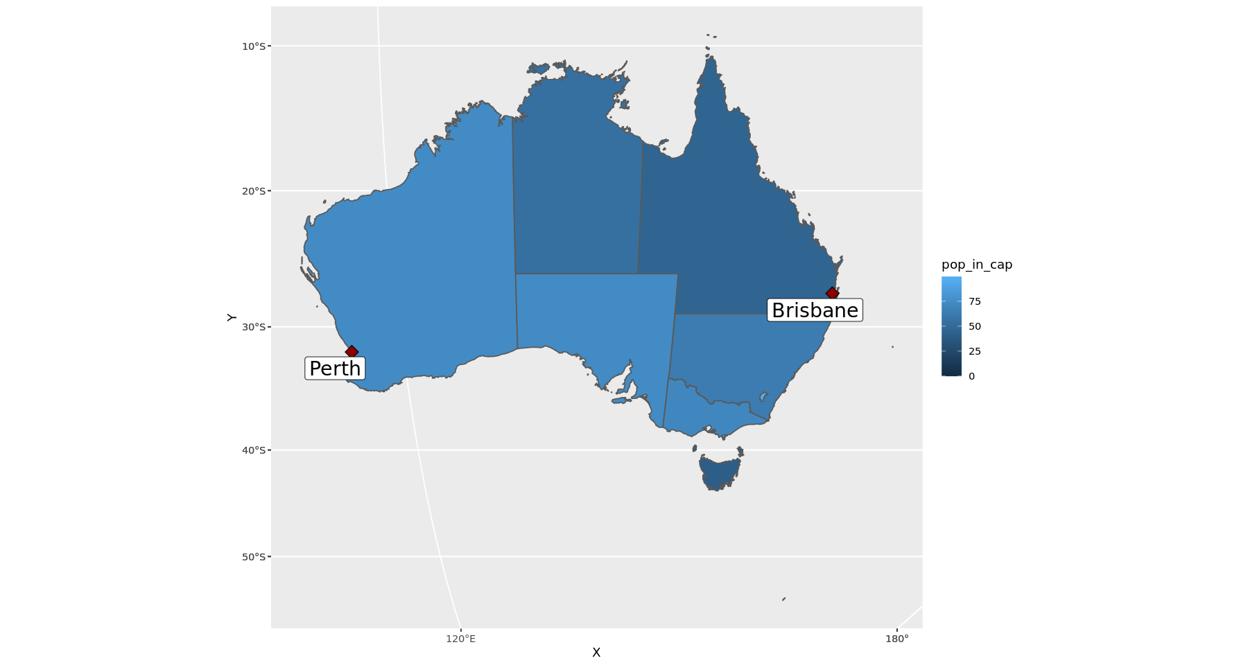
geom_sf_label in the example above can be tranformed by coord_sf, which is why the labels show up in the correct place. But the labels will not automatically adjust themselves if your figure has many crowded labels. That's why I used geom_label_repel at the start - but geom_label_repel cant be transformed by coord_sf!
So how can we have both the automcatic label adjustment and the projection correction
(without having to calculate all the positioning ourselves)? We have to use something else:
geom_sf_label_repel that will give us both features.
The geom_sf_label_repel is in a separate library. Install using devtools::install_github("yutannihilation/ggsflabel")
library(ggsflabel)

# The geom_sf_label_repel is in a seperate library
# install using
# devtools::install_github("yutannihilation/ggsflabel")

australia <-  ggplot(data = in_sf) +
    geom_sf(aes(fill = pop_in_cap)) +
    geom_sf(data = label_frame, size = 4, shape = 23, fill = "darkred") +
    geom_sf_label_repel(
        data = label_frame,
        aes(geometry = geometry, label = Label),
        size = 6, force = 5, force_pull = 5) +
    coord_sf(crs=this_crs)
australia
Making Maps in R
A comprehensive guide to creating beautiful maps in R, from basics to advanced projections